Wealthify Ai

A program designed to help new and practiced investor have more personalized investment exploration and planning experience.

I was able to participate in a hackathon with a group of data-analyst, software engineers and product manager. We are given only 10 days and a chosen prompt given at the start of said 10 days, and develop a solution to the prompt given for the project.

Year
2023-2024

Client

Chegg Skills

Services
Secondary and Market Research, Wireframing and Prototyping, User Flows, Information Technology, Usability Testing, and Presentation Design

Laptop on a white desk displaying the homepage of a financial advice website called Wealthy AI, showing a young woman using her phone. Behind the laptop, there is an external monitor, headphones, a cup, a potted plant, and a pair of sunglasses on the desk, with a window letting in natural light.
Person holding smartphone displaying financial planning app with graphs and data about investment performance.
A digital dashboard showing a pie chart about investment decision factors with options to start over or add to plans.
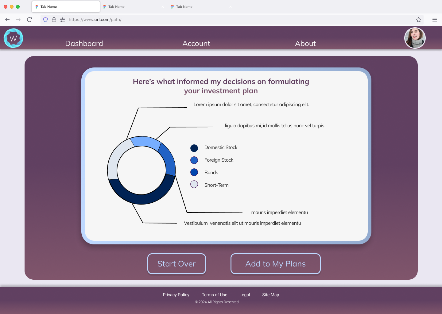
  • WealthifyAi gives the users the option to develop unique plans by answering a few questions to narrow down the advice the AI Advisor within the website/application can give them. The user can have multiple plans saved within the application and can refer back to them within the plans section, as well as view its performance over varying time frames depending on how long the plan has been in existence. The program also offers ways the user can further their education and knowledge of both investment terminology, strategies, and links to educational videos over other investment topics they might want to explore.

  • Over our first meeting, we wanted to establish our scope for the next 10 days, as well as availability for the group. Everyone on the group had a day-job on top of participating, so we wanted to balance out everyone's workload and schedules to see how we can plan out our game plan.

    • Empower users to explore a wide variety of investment strategies through simulation and guided learning.

    • Provide AI-generated insights and personalized recommendations based on user profiles and goals.

    • Enhance financial literacy through interactive tools and real-time feedback.

    • Foster user trust through transparency, data privacy, and clear explanations of AI decisions.

First Steps

Research to establish scope of each feature that was presented to me every quarter.

A user journey chart for an active investor named Gwen, age 46, researching app investment strategies. The chart has phases from need to secure, with a feelings and thoughts curve showing questions about app features and data update frequency. Action points include market research, downloading the app, and exploring dashboards. Opportunities include clear onboarding and a private platform, while pain points focus on trust and user security.

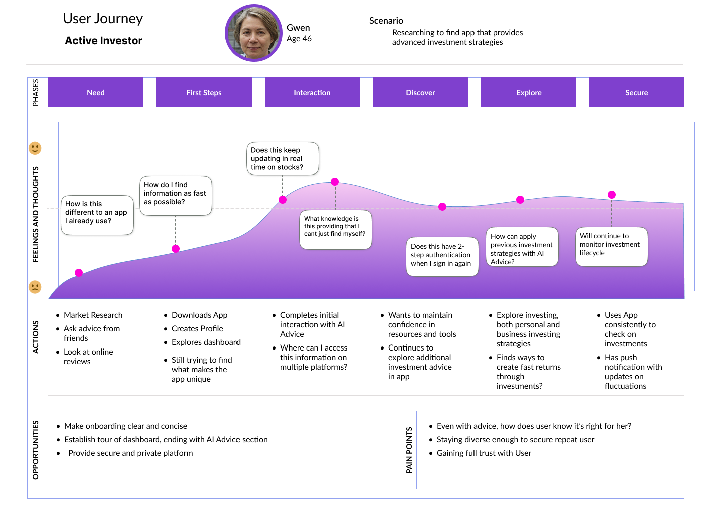
Journey mapping a sign-up flow

Comparison chart displaying three investment platforms: Invstr, Fidelity Go, and Betterment. Each platform includes sections with info on unique value proposition, company advantages, disadvantages, and site links. Invstr offers interactive investment courses; Fidelity Go emphasizes portfolio rebalancing; Betterment features tax-efficient tools and professional advice.

Competitive Analysis

Empathy Mapping

A diagram titled 'PERSON PERSPECTIVE' with a subtitle 'Stable, Salaried Professional'. It features a central illustration of a person named George with glasses and a beard, labeled 'Say and Do?'. The diagram is divided into three sections: 'Think and Feel?', 'Hear?', and 'See?', each with relevant questions or observations. The 'Think and Feel?' section includes questions about financial planning and investing, such as 'How can I plan for both myself and my family financial future?' and 'Should I look into crypto?'. The 'Hear?' section lists sources like radio, LinkedIn, and seeing viral investing influencers. The 'See?' section mentions other parents at school, family space constraints, and investment environment. The bottom section contains three questions in orange about investment strategies and goals.
Flowchart diagram for an investment app onboarding process, including steps for account creation, advice routing, risk assessment, and user questions.

Early sketching of user flow and pages on mobile view

Flexibility

Given new and ever-changing features to focus on for the ever-evolving needs of the app.

Mobile app screen for creating an account, showing fields for username and password with a 'Create' button, and instructions for password complexity.
A finance app dashboard displaying two investment plans: House Down-Payment and General Savings Plan, with pie charts and timelines for investment durations.

Pivoting between the two designs, the first being more mobile forward, and the second being more desktop focused

Mobile app screen for creating a new account, with fields for username and password, and instructions for password length and complexity.
A digital finance planning dashboard with two pie charts showing investment allocations and timeframes, and two blank sections with plus signs for adding new plans.

Consistency

With an information-dense product like Wealthify AI, you need to keep the designs simple, straightforward, and easy to approach.

Financial planning dashboard displaying two plans with pie charts and durations, with a purple background and user profile picture in the top right corner.
A digital dashboard displaying a chart on investment planning in a web browser, with navigation options labeled Dashboard, Account, and About at the top, and two buttons labeled Start Over and Add to My Plans at the bottom.
A webpage with a purple theme displaying a form asking, "How much money do you have to invest today?" with an input box and a "Confirm" button. The top menu has links: Dashboard, Account, About, and a profile picture of a woman in the upper right corner.